I’ve fallen in love with PEAR’s Image_Graph package. More than once I’ve come up against a requirement, and then found that the developers have implemented a solution in quite an elegant way. They’d be the first to admit there’s still lots to do – the package is after all still an alpha release. But it’s achieved a lot, so I can’t resist taking it on a second date. After last month’s introduction, this time I look a little deeper into the available functionality.
Using a background image
As developers, we should all know how clients are usually impressed by glitz, and not substance. A great-looking site with shoddy backend code is much more likely to impress than a poor-looking site with stunning code. It’s the same with graphs. Perhaps a background image is just the touch of class needed to make the figures on that ever-so-important graph stand out from the crowd. Here’s how you do it. Taking last week’s image_graph4.php as a basis, add the bolded lines. You can download and reuse the helicopter image (under a Creative Commons licence) here.
2image_graph1.php

<?php
include 'Image/Graph.php';
$Graph =& Image_Graph::factory('graph', array(600, 300));
$Plotarea =& $Graph->addNew('plotarea');
$Dataset =& Image_Graph::factory('dataset');
$Dataset->addPoint('Jan', 5, 'J');
$Dataset->addPoint('Feb', 13, 'F');
$Dataset->addPoint('March', 10, 'M');
$Plot =& $Plotarea->addNew('bar', &$Dataset);

$Plot->setLineColor('green');
$Plot->setBackgroundColor('[email protected]');

$fill =& Image_Graph::factory('Image_Graph_Fill_Array');
$fill->addColor('red', 'J');
$fill->addColor('blue', 'F');
$fill->addColor('yellow', 'M');
$Plot->setFillStyle($fill);

//set Background
$bgfill =& Image_Graph::factory('Image_Graph_Fill_Image', 'images/helicopter.jpg');
$Plotarea->setFillStyle($bgfill);

$Font =& $Graph->addNew('ttf_font', 'Bitstream-Vera-Sans-Mono');
$Font->setSize(12);
$Graph->setFont($Font);

$YAxis =& $Plotarea->getAxis(IMAGE_GRAPH_AXIS_Y);
$YAxis->setTitle('Rainy Days', 'vertical');
$XAxis =& $Plotarea->getAxis(IMAGE_GRAPH_AXIS_X);
$XAxis->setTitle('Month');

$Graph->done();
?>
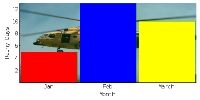
Unfortunately your beautiful image is obscured by the harsh colours of the graph. We can’t have that. Let’s add some transparency to the three bars. By adding @0.x immediately after the colour, x being a positive number, the colour is made transparent. The closer to zero x is, the more transparent the bar. Change the parameters passed to the addColor method, as follows:
$fill->addColor('[email protected]', 'J');
$fill->addColor('[email protected]', 'F');
$fill->addColor('[email protected]', 'M');
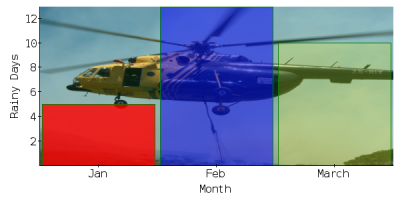
Now we can see the helicopter in (almost) all of its glory. For best results, many graphs of this type use a transparency of around 0.2, but it of course depends on your background and your visual intent. Our example gives you a range to show you the effects, but you’ll probably agree that the red in particular at 0.8 is still too strong.
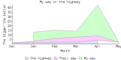
A stacked area chart
Let’s look at a slightly different sort of example – a stacked area chart. Fundamentally, very little is different, as you’d expect in an abstract class like this. When calling the addNew method on our PlotArea object, simply specify stacked instead of bar. For our stacked area chart, we’re going to create an array of datasets to stack on top of each other. They will appear in order of bottom to top.
<?php
2image_graph2.php

include 'Image/Graph.php';

// create a graph 600 pixels wide by 300 high
$Graph = & Image_Graph::factory('graph', array(600, 300));

$Font =& $Graph->addNew('ttf_font', 'Bitstream-Vera-Sans-Mono');
$Font->setSize(12);

$Graph->setFont($Font);

$Graph->add(
  Image_Graph::vertical(
    Image_Graph::factory('title', array('My way or the highway', 12)),
    Image_Graph::vertical(
      $Plotarea = Image_Graph::factory('plotarea'),
      $Legend = Image_Graph::factory('legend'),
      90
    ),
    5
  )
);
$Legend->setPlotarea($Plotarea);


// Create and populate 3 datasets

$Dataset1 =& Image_Graph::factory('dataset');
$Dataset1->addPoint('Jan', 1);
$Dataset1->addPoint('Feb', 2);
$Dataset1->addPoint('Mar', 2);
$Dataset1->addPoint('Apr', 4);

$Dataset2 =& Image_Graph::factory('dataset');
$Dataset2->addPoint('Jan', 3);
$Dataset2->addPoint('Feb', 4);
$Dataset2->addPoint('Mar', 5);
$Dataset2->addPoint('Apr', 2);

$Dataset3 =& Image_Graph::factory('dataset');
$Dataset3->addPoint('Jan', 10);
$Dataset3->addPoint('Feb', 9);
$Dataset3->addPoint('Mar', 12);
$Dataset3->addPoint('Apr', 34);


$Dataset1->setName('The highway');
$Dataset2->setName('Their way');
$Dataset3->setName('My way');

$Datasets = array($Dataset1,$Dataset2,$Dataset3);

$Plot =& $Plotarea->addNew('Image_Graph_Plot_Area', array($Datasets,'stacked'));

$Plot->setLineColor('gray');

$FillArray =& Image_Graph::factory('Image_Graph_Fill_Array');
$FillArray->addColor('[email protected]');
$FillArray->addColor('[email protected]');
$FillArray->addColor('[email protected]');

// set a standard fill style
$Plot->setFillStyle($FillArray);

$XAxis =& $Plotarea->getAxis(IMAGE_GRAPH_AXIS_X);
$XAxis->setTitle('Month');

$YAxis =& $Plotarea->getAxis(IMAGE_GRAPH_AXIS_Y);
$YAxis->setTitle('The bigger the better', 'vertical');

// output the Graph
$Graph->done();
?>
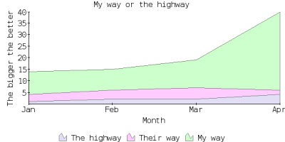
Note that when defining our datasets, all the points use the same labels (the month). If we changed the labels for any of the points, the graph would adjust accordingly. For example, replacing Jan with Dec in the first dataset effectively creates a fifth point.
$Dataset1->addPoint('Dec', 1);
$Dataset1->addPoint('Feb', 2);
$Dataset1->addPoint('Mar', 2);
$Dataset1->addPoint('Apr', 4);
Adding another new point, in dataset2:
$Dataset1 =& Image_Graph::factory('dataset');
$Dataset1->addPoint('Dec', 1);
$Dataset1->addPoint('Feb', 2);
$Dataset1->addPoint('Mar', 2);
$Dataset1->addPoint('Apr', 4);

$Dataset2 =& Image_Graph::factory('dataset');
$Dataset2->addPoint('Jan', 3);
$Dataset2->addPoint('Feb', 4);
$Dataset2->addPoint('Apr', 5);
$Dataset2->addPoint('May', 2);
Two graphs with a different axis
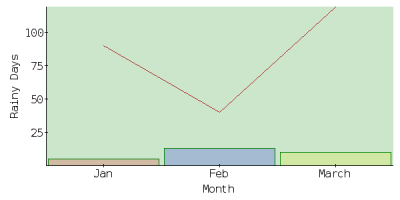
It’s possible to want to display two graphs on the same plot area, but with very different measurement scales. For this, you’ll need different axes. The left axis is used for one graph, and the right axis for the other. Here’s how it’s possible. Taking the bar graph we created in last month’s article, image_graph4.php, as a basis, let’s first create a second dataset. We’ll add a line graph on top of the original bar chart. There’s no need to use unique identifiers, as we’re not worrying about fill styles with a line graph.
2image_graph5.php

<?php
include 'Image/Graph.php';
$Graph =& Image_Graph::factory('graph', array(600, 300));
$Plotarea =& $Graph->addNew('plotarea');
$Dataset =& Image_Graph::factory('dataset');
$Dataset->addPoint('Jan', 5, 'J');
$Dataset->addPoint('Feb', 13, 'F');
$Dataset->addPoint('March', 10, 'M');
$Plot =& $Plotarea->addNew('bar', &$Dataset);

$Plot->setLineColor('green');
$Plot->setBackgroundColor('[email protected]');

$Dataset2 =& Image_Graph::factory('dataset');
$Dataset2->addPoint('Jan', 9);
$Dataset2->addPoint('Feb', 4);
$Dataset2->addPoint('March', 12);
$Plot2 =& $Plotarea->addNew('line', &$Dataset2);

$Plot2->setLineColor('firebrick'); // yes, that's a colour
$Plot2->setBackgroundColor('[email protected]');

$fill =& Image_Graph::factory('Image_Graph_Fill_Array');
$fill->addColor('[email protected]', 'J');
$fill->addColor('[email protected]', 'F');
$fill->addColor('[email protected]', 'M');
$Plot->setFillStyle($fill);

$Font =& $Graph->addNew('ttf_font', 'Bitstream-Vera-Sans-Mono');
$Font->setSize(12);
$Graph->setFont($Font);

$YAxis =& $Plotarea->getAxis(IMAGE_GRAPH_AXIS_Y);
$YAxis->setTitle('Rainy Days', 'vertical');
$XAxis =& $Plotarea->getAxis(IMAGE_GRAPH_AXIS_X);
$XAxis->setTitle('Month');

$Graph->done();
?>