Plotting Vertical Columns And X Labels
Plotting the labels is basically just a repetition of what’s been done before for the
Y axis, with slightly changing X and Y positions. The only thing to consider is that if
the labels (i.e. the array keys taken from
width of a column (
relative sizes all along, this can easily be corrected by just using a bigger
Y axis, with slightly changing X and Y positions. The only thing to consider is that if
the labels (i.e. the array keys taken from
$data) are too big to fit in thewidth of a column (
$base), they will overlap. However, since the code usesrelative sizes all along, this can easily be corrected by just using a bigger
$width.
We draw the vertical columns as filled rectangles in navy blue. This requires that we
know the X and Y limits of the rectangle. In the vertical Y direction, we use a scaling
factor that represents the number of pixels for one data unit. In our case, that would be
the number of pixels per percentage point. In the X direction, the width of the column is
just the distance between columns –
$base – less some right and left padding.
<?php
// columns and x labels


$padding = 3; // half of spacing between columns


$yscale = $ysize / (($ngrid+1) * $dydat); // pixels per data unit
for ($i = 0; list($xval, $yval) = each($data); $i++) {
    // vertical columns


    $ymax = $vmargin + $ysize;


    $ymin = $ymax - (int)($yval*$yscale);


    $xmax = $hmargin + ($i+1)*$base - $padding;


    $xmin = $hmargin + $i*$base + $padding;
    imagefilledrectangle($image, $xmin, $ymin, $xmax, $ymax, $navy);
    // x labels


    $txtsz = imagefontwidth($labelfont) * strlen($xval);
    $xpos = $xmin + (int)(($base - $txtsz) / 2);


    $xpos = max($xmin, $xpos);


    $ypos = $ymax + 3; // distance from x axis
    imagestring($image, $labelfont, $xpos, $ypos, $xval, $black);


}
?>
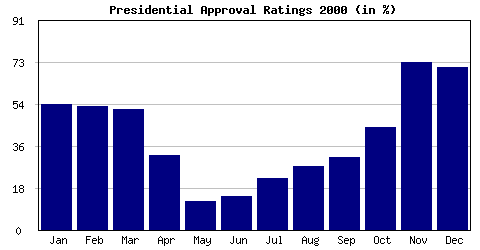
The final result of this whole effort looks like this:
What Remains To Be Done
You may note in the chart above that there seems to be a slight glitch for the first
value. In January, approval was 55% but the column just reaches the 54% grid line.
Actually, the grid line is at 54.75%. The cast to
Y labels seems to truncate instead of rounding. If this bothers you, use the correct
rounding function instead:
Another possibility is to never do casts and format numbers using
value. In January, approval was 55% but the column just reaches the 54% grid line.
Actually, the grid line is at 54.75%. The cast to
(int) used for theY labels seems to truncate instead of rounding. If this bothers you, use the correct
rounding function instead:
floor($positive_value_to_round + 0.5).Another possibility is to never do casts and format numbers using
sprintf().
To create more fancy graphs, you can fill the columns with a pattern loaded from
another image file. In fact, the stretching of small GIFs we’ve described in the
“Alternatives” section can also be done in PHP. First, you need to load the
GIF with
the chart using
another image file. In fact, the stretching of small GIFs we’ve described in the
“Alternatives” section can also be done in PHP. First, you need to load the
GIF with
ImageCreateFromGif(). Then, you copy a stretched version of it intothe chart using
ImageCopyResized().
If there are multiple series to plot, line charts are more convenient than bar charts.
In that case, you’d use
Allan Kent’s column “Graphing With PHP and GD” for further ideas.
In that case, you’d use
ImageLine() to do the graphing. I refer you toAllan Kent’s column “Graphing With PHP and GD” for further ideas.
Finally, you have to figure out a way to get your data into the
Since I use MySQL for most of my work, I find the SQL
very useful. To create time series like the one above with records containing
$data array.Since I use MySQL for most of my work, I find the SQL
COUNT(*) constructvery useful. To create time series like the one above with records containing
DATETIME fields, I’d use:"SELECT COUNT(*) FROM table WHERE date LIKE '%-$month-%'"