Adding A Title
Remember how your science teacher would always bug you about labels and units? Well,
both really are important, so let’s add a title using built-in font number 3 (out of 1..5).
Fonts other than numbers 1-5 have to be loaded first.
both really are important, so let’s add a title using built-in font number 3 (out of 1..5).
Fonts other than numbers 1-5 have to be loaded first.
The
given (X, Y) position. In order to center the title, we need to calculate the left X
limit of the string. For this, we subtract half of the width of the string from the
middle position. The width of the string in pixels is obtained using
All of this put together gives:
imagestring() function draws a string on the image, starting at agiven (X, Y) position. In order to center the title, we need to calculate the left X
limit of the string. For this, we subtract half of the width of the string from the
middle position. The width of the string in pixels is obtained using
imagefontwidth(), who returns the pixel width of a character in a given font.All of this put together gives:
<?php
// title


$titlefont = 3;


$title = "Presidential Approval Ratings 2000 (in %)";
// pixel-width of title


$txtsz = imagefontwidth($titlefont) * strlen($title);
$xpos = (int)($hmargin + ($xsize - $txtsz)/2); // center the title


$xpos = max(1, $xpos); // force positive coordinates


$ypos = 3; // distance from top
imagestring($image, $titlefont, $xpos, $ypos, $title , $black);
?>
At this point, the chart looks like this:

Adding Y Labels And A Horizontal Grid
The following code draws grid lines at the Y tick heights and prints the tick labels at
the same time.
the same time.
We first define the font to use for the labels and the number of grid lines on the chart.
Next, we calculate how many data units are between grid lines. In our example, we are
plotting percentages, so the 4 grid lines could be at 20%, 40%, 60% and 80%. They are
separated by a number of pixels equal to one fifth of the height of the
chart (
because it auto-scales the Y axis.
Next, we calculate how many data units are between grid lines. In our example, we are
plotting percentages, so the 4 grid lines could be at 20%, 40%, 60% and 80%. They are
separated by a number of pixels equal to one fifth of the height of the
chart (
$ysize). The code below actually doesn’t produce 20% stepsbecause it auto-scales the Y axis.
While iterating from 0% to 100%, we print a label on the left-hand side and a
horizontal grid line each time. The label is centered vertically at the level of the grid
line and horizontally in the middle of the left vertical margin. We use the same centering
technique as before for the title.
horizontal grid line each time. The label is centered vertically at the level of the grid
line and horizontally in the middle of the left vertical margin. We use the same centering
technique as before for the title.
<?php
// y labels and grid lines
$labelfont = 2;
$ngrid = 4; // number of grid lines
$dydat = $maxval / $ngrid; // data units between grid lines
$dypix = $ysize / ($ngrid + 1); // pixels between grid lines
for ($i = 0; $i <= ($ngrid + 1); $i++) {
// iterate over y ticks
$ydat = (int)($i * $dydat); // height of grid line in units of data
$ypos = $vmargin + $ysize - (int)($i*$dypix); // height of grid line in pixels
$txtsz = imagefontwidth($labelfont) * strlen($ydat); // pixel-width of label
$txtht = imagefontheight($labelfont); // pixel-height of label
$xpos = (int)(($hmargin - $txtsz) / 2);
$xpos = max(1, $xpos);
imagestring($image, $labelfont, $xpos, $ypos - (int)($txtht/2), $ydat, $black);
if (!(
$i == 0) && !($i > $ngrid))
imageline($image, $hmargin - 3, $ypos, $hmargin + $xsize, $ypos, $gray);
// don't draw at Y=0 and top
}
?>
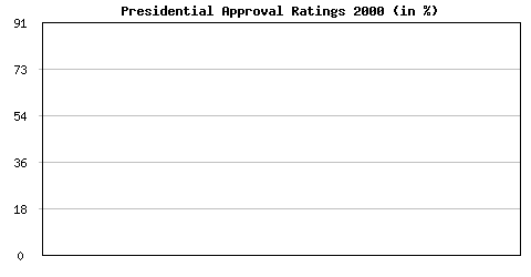
With this, our glorious chart already takes on a more useful shape:


